Gallery
Gallery is a full-featured media component built on top of Carousel. You give it a list of items and pick a display mode — the same data renders as a packed masonry grid, a justified row layout, a uniform grid, a file-list, an inline slider, an autoplaying slideshow, or a headless lightbox that you drive from your own thumbnails.
Every mode (except lightbox, which has no thumbnails) opens a full-screen modal carousel on click, with pinch-to-zoom, swipe-to-dismiss, keyboard navigation, page navigation for PDFs, and built-in renderers for video, 360° panoramas, and iframe embeds.
Import
Section titled “Import”import { Gallery, type GalleryItem, type GalleryDisplay } from '@delightstack/components';Basic usage
Section titled “Basic usage”The minimum is a list of items. Strings are treated as image URLs; objects accept the full GalleryItem shape. Include width and height whenever you can — they let masonry layouts reserve the correct space before each image loads.
View code
<script lang="ts">  import { Gallery, type GalleryItem } from '@delightstack/components';
  const items: GalleryItem[] = [ { src: '/photos/ridge.jpg', width: 1200, height: 800, name: 'Mountain ridge' },    { src: '/photos/doorway.jpg', width: 800, height: 1200, name: 'Quiet doorway' }, { src: '/photos/coast.jpg', width: 1600, height: 900, name: 'Coastline' },    // ... ];
</script>
<Gallery {items} />
Display modes
Section titled “Display modes”The same items array can render seven different ways. Flip between them below to compare — note how the layout, aspect ratios, and clickable region differ.
Brick-style packed grid that respects each image’s aspect ratio. Best for varied photo sets.
View code
<script lang="ts">  import { Gallery, type GalleryDisplay } from '@delightstack/components';
 let display = $state<GalleryDisplay>('masonry');
</script>
<Gallery {items} {display} aspect_ratio="16/9" />| Mode | Layout | When to use it |
|---|---|---|
masonry (default) | Brick-packed grid that respects each image’s aspect ratio. Wider images span more columns. | Photo sets where the original framing matters and the mix of orientations is part of the appeal. |
masonry-row | Justified rows. Each row fills the full width edge-to-edge, varying the row height to preserve aspect ratios. | Press galleries, photojournalism, or any “Flickr-style” gallery where horizontal alignment matters. |
grid | Uniform square cells. Images crop to object-fit: cover to fit the cell. | Product grids, contact sheets, or anywhere consistency beats faithfulness to the original ratio. |
list | Vertical list with a small thumbnail + name. Compact, scannable. | File managers, attachment lists, document libraries. |
slider | Inline carousel — one item at a time with paging controls below. | Hero sections, product image switchers, embedded story viewers. |
slideshow | Same shell as slider but tuned for autoplay (subtle zoom + crossfade). | Background slideshows, kiosks, “now playing” displays. |
lightbox | Renders nothing. You provide your own thumbnails; the carousel opens when you set slide or call open(). | When you need full control of the thumbnail layout — mixed with text, in cards, scattered across the page, etc. See Lightbox below. |
Sizing
Section titled “Sizing”size adjusts how dense the thumbnails are on the delightstack numeric scale ('00'–'3', where '1' is the standard). It changes column counts for grid/masonry, row heights for masonry-row, and row height for list.
View code
<Gallery {items} display="masonry" size="2" />Spacing and radius
Section titled “Spacing and radius”spacing controls the gap between items, and radius controls the corner radius. Both use the delightstack numeric scale ('0'–'3', where '1' is the standard); radius scales with the gallery gap so the two stay visually balanced.
View code
<Gallery {items} display="grid" spacing="2" radius="2" />List mode
Section titled “List mode”List mode is the odd one out: a small thumbnail plus a name in a single row. Use it for any “library of files” feel.
View code
<Gallery {items} display="list" />Inline slider
Section titled “Inline slider”display="slider" embeds a single-image carousel in the page flow with arrows, page counter, fullscreen toggle, and an optional play button. The aspect_ratio prop locks the frame to a fixed shape so the layout doesn’t reflow as images load.
View code
<Gallery {items} display="slider" aspect_ratio="16/9" />Slideshow with autoplay
Section titled “Slideshow with autoplay”display="slideshow" is the same shell as slider but tuned for unattended playback: while autoplaying it applies a slow Ken-Burns-style zoom and crossfades between slides. Set duration (ms) to control the per-slide dwell time. Autoplay automatically pauses when the slideshow scrolls out of view.
View code
<Gallery {items} display="slideshow" aspect_ratio="16/9" autoplay duration={4000} meta_display_fullscreen="always" />Per-item actions
Section titled “Per-item actions”The actions prop is a 2D array — one row per item, one entry per button. Each button can have an icon, href, target, click handler, and a nested actions array for a dropdown menu. Hover any thumbnail in the demo below to reveal its download button.
View code
<script lang="ts">  import {    Gallery,    pickLargestSrc,    type GalleryItemAction,  } from '@delightstack/components';
  const actions: GalleryItemAction[][] = items.map((item) => [ {      name: 'Download', tooltip: 'Download original',      href: pickLargestSrc(item.src), target: '_blank',    }, ]);
</script>
<Gallery {items} display="masonry" {actions} action_display="hover" />
Lightbox (headless mode)
Section titled “Lightbox (headless mode)”display="lightbox" is the “bring your own thumbnails” mode. Gallery renders nothing of its own — instead, you render the trigger elements (buttons, images, cards, anywhere on the page) and open the carousel by either:
- Setting
slideto the item index you want to open.slide = -1closes the modal. - Calling
gallery.open(index, fromElement?)viabind:this. The optionalfromElementanchors the open animation to your trigger so the modal appears to zoom out of it.
Use this when the built-in grid modes don’t fit — e.g. you want thumbnails interleaved with prose, displayed as cards with custom metadata, or scattered across several sections of the page.
The Gallery renders nothing of its own here — the thumbnail layout below is plain HTML
on this page. Clicking a tile calls gallery.open(index, event.currentTarget) which opens the carousel anchored to that tile.
View code
<script lang="ts">  import { Gallery, pickLargestSrc } from '@delightstack/components';
 let gallery = $state<ReturnType<typeof Gallery>>();
</script>
<div class="thumbs">  {#each items as item, i}    <button onclick={(e) => gallery?.open(i, e.currentTarget)}>      <img src={pickLargestSrc(item.src)} alt={item.alt} />    </button>  {/each}</div>
<Gallery bind:this={gallery} {items} display="lightbox" />
Rich media
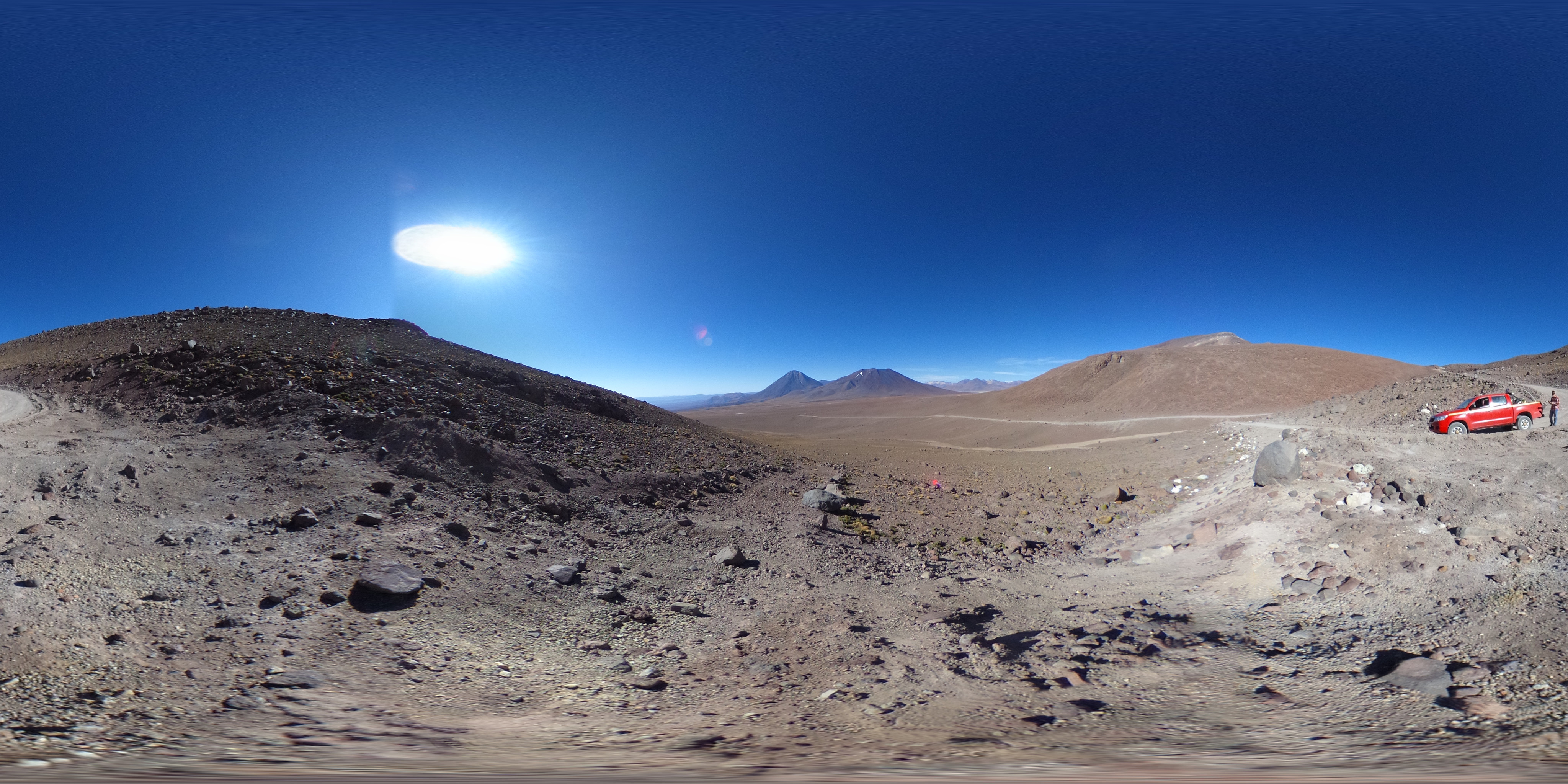
Section titled “Rich media”Gallery accepts the same item types as Carousel: image, video, pdf, embed, and custom. Set type (and panorama: true for 360° images) and Gallery handles the rest — the rich renderers load on demand the first time you open the lightbox on one.
PDFs are easy to spot in the thumbnail grid (the lightbox shows them with a built-in viewer and vertical page-flipping); video items show a play icon overlay; embeds show an embed icon; panoramas show a 360° icon.

View code
<script lang="ts">  import { Gallery, type GalleryItem } from '@delightstack/components';
  // Tip: interleave images between rich items so the lightbox carousel never  // has to keep two heavy renderers (pdfjs, three.js, video) mounted at once.  const items: GalleryItem[] = [    { src: '/photos/valley.jpg', width: 1600, height: 1000 },    { src: '/photos/river.jpg', width: 1600, height: 1000 },    { type: 'pdf', src: '/documents/paper.pdf', width: 850, height: 1100 },    { src: '/photos/forest.jpg', width: 1600, height: 1000 },    { type: 'image', panorama: true, src: '/panoramas/valley.jpg' },    { src: '/photos/coast.jpg', width: 1600, height: 1000 },    { type: 'video', src: '/videos/intro.mp4' },    { src: '/photos/library.jpg', width: 1600, height: 1000 },  ];
</script>
<Gallery {items} display="masonry-row" />
Autoplay video in the lightbox
Section titled “Autoplay video in the lightbox”Set autoplay_video to start a video the moment the lightbox is launched onto it. Because opening is driven by a user gesture — a thumbnail click or the open() method — the browser allows playback with sound. Only the slide the lightbox opens to auto-plays, and only when it’s a video; other slide types are left alone, and navigating/swiping between slides does not auto-play.
Click any thumbnail below — the modal opens and that video starts playing.
View code
<script lang="ts">  import { Gallery, type GalleryItem } from '@delightstack/components';
  const items: GalleryItem[] = [    { type: 'video', src: '/videos/clip-1.mp4', poster: '/videos/clip-1.jpg' },    { type: 'video', src: '/videos/clip-2.mp4', poster: '/videos/clip-2.jpg' },    { type: 'video', src: '/videos/clip-3.mp4', poster: '/videos/clip-3.jpg' },    // ...  ];</script>
<Gallery {items} display="grid" autoplay_video />
Custom item type
Section titled “Custom item type”For media types the built-ins don’t cover — a Matterport tour, a custom 3D viewer, a chart, an interactive form — set type: 'custom' on the item and provide the custom snippet. The snippet receives { item, active, gesture_disabled, onload, onerror }. See Carousel’s custom type docs for the full snippet signature.
Pair with disable_swipe: true when your widget needs horizontal pointer input.
The Gallery is in display="lightbox" mode (no thumbnails) since type: 'custom' items don't have a thumbnail representation. Open the modal using the buttons above. On
the custom slide, drag the slider horizontally — the carousel won't try to swipe to the
next slide.
View code
<script lang="ts">  import { Gallery, type GalleryItem } from '@delightstack/components';
  const items: GalleryItem[] = [    {      type: 'custom', src: '',      name: 'Interactive counter', disable_swipe: true,    },    { type: 'image', src: '/photos/sunset.jpg' },  ];
  let count = $state(0);
</script>
<Gallery {items} display="grid"> {#snippet custom({ item, active })} <div class="my-slide" class:active> <button onclick={() => count++}>{count}</button> </div> {/snippet}</Gallery>| Prop | Type | Default | Notes |
|---|---|---|---|
items | GalleryItem[] | [] | Strings are treated as image URLs. See GalleryItem. |
display | GalleryDisplay | 'masonry' | See Display modes. |
size | '00' | '0' | '1' | '2' | '3' | '1' | Thumbnail density (numeric scale; '1' standard, lower = smaller, higher = larger). |
spacing | '0' | '1' | '2' | '3' | '1' | Gap between thumbnails (numeric scale; '0' removes the gap). |
radius | '0' | '1' | '2' | '3' | '1' | Corner radius of thumbnails (numeric scale; '0' is square). |
slide | number (bindable) | -1 (or 0 for slider) | The currently displayed item index. -1 keeps the modal closed. |
fit | 'cover' | 'contain' | 'contain' | object-fit for items inside the carousel. |
aspect_ratio | string | undefined | CSS aspect ratio for the slider/slideshow frame (e.g. "16/9"). Ignored when the modal is open. |
autoplay | boolean | false | Auto-advance slides. Paused while scrolled off-screen. |
autoplay_video | boolean | false | Auto-play a video when the lightbox is launched onto it (not when changing slides). Only the slide opened to, and only when it’s a video. The opening gesture lets the browser play with sound. |
duration | number | 8000 | Autoplay dwell time per slide (ms). |
inline | boolean | auto | When true, disables vertical/dismiss gestures. Defaults to true for slider when not fullscreen. |
disable_fullscreen | boolean | false | Hide the fullscreen toggle. |
controls | 'default' | 'inline' | 'overlay' | 'disable' | 'default' | Where slider controls appear. default = inline when embedded, overlay when modal. |
meta_display | 'none' | 'always' | 'hover' | 'hover' | When to show the name overlay on thumbnails. |
meta_display_fullscreen | 'none' | 'always' | 'none' | When to show the caption in the fullscreen carousel. |
action_display | 'none' | 'always' | 'hover' | 'hover' | When to show the action buttons on thumbnails. |
actions | GalleryItemAction[][] | [] | Per-item action buttons. See GalleryItemAction. |
page | number (bindable) | 0 | Current page index inside a multi-page item (e.g. a PDF). |
num_pages | number (bindable) | 1 | Number of pages in the current item. Set automatically for PDFs. |
custom | Snippet | undefined | Renderer for items with type: 'custom'. Forwarded to Carousel. |
onclick | (event, index) => void | false | undefined | Return false from the handler to prevent the modal from opening. |
style | string | '' | Inline style passed to the gallery root. |
Methods
Section titled “Methods”Bind the Gallery with bind:this={gallery} and call these directly:
| Method | Description |
|---|---|
open(index, from?) | Open the modal at index. Pass an HTMLElement as from to anchor the open animation to that element (typical for display="lightbox"). |
close() | Close the modal. Exits fullscreen first if active. |
goto(i) | Jump to slide i. No-op when the modal isn’t open. |
next(amount=1) | Advance by amount slides (wraps at the end). |
prev(amount=1) | Go back by amount slides (wraps at the start). |
play() | Start the autoplay timer. |
pause() | Pause the autoplay timer. |
toggleFullscreen() | Enter or exit the browser’s fullscreen mode. |
GalleryItem
Section titled “GalleryItem”type GalleryItem = string | (Partial<CarouselItem> & { favorite?: boolean });Items can be a plain image URL string, or an object:
| Field | Type | Notes |
|---|---|---|
id | string | Stable key — defaults to src. |
type | 'image' | 'video' | 'pdf' | 'embed' | 'custom' | Defaults to 'image'. See Carousel types for the full per-type behaviour. |
src | string | URL, or a srcset string with width descriptors ("sm.jpg 400w, lg.jpg 1600w"). May be empty for custom. |
width / height | number | Intrinsic pixel dimensions. Required for masonry layouts so each tile can reserve space before the image loads. |
name | string | Short label, shown on the thumbnail and used as fallback alt text. |
caption | string | Longer caption, shown in the fullscreen overlay when meta_display_fullscreen="always". |
alt | string | Explicit alt text override. |
thumbhash | string | Base64 ThumbHash — decoded internally into a tiny blurred placeholder while the full image loads. |
priority | boolean | Mark above-the-fold items so they get loading="eager" + fetchpriority="high". |
panorama | boolean | When type: 'image', render the image as a 360° panorama (uses Panorama, loaded lazily). |
disable_swipe | boolean | Suppress the carousel’s horizontal swipe-to-change-slide gesture for this item. Useful for custom items with their own horizontal input. |
disable_zoom | boolean | Suppress the carousel’s pinch-zoom for this item. |
favorite | boolean | In masonry layouts, favorite items span twice the columns/rows. |
GalleryDisplay
Section titled “GalleryDisplay”type GalleryDisplay = | 'masonry' | 'masonry-row' | 'grid' | 'list' | 'slider' | 'slideshow' | 'lightbox';GalleryItemAction
Section titled “GalleryItemAction”interface GalleryItemAction { icon?: Component; name?: string; // "Download", "Share", etc. tooltip?: string; // optional secondary label (filename, size, etc.) href?: string; target?: '_blank' | '_self'; click?: (event: Event) => unknown; actions?: GalleryItemAction[]; // nested → renders as a dropdown menu}Accessibility
Section titled “Accessibility”- The modal carousel uses focus-trap —
Tabcycles within the modal,Escapecloses it, and focus returns to the thumbnail that opened it (or, indisplay="lightbox", to whatever element triggeredopen()). - Each thumbnail is keyboard-activatable (
Enteropens the modal) and has a focus ring. - Slide changes are announced via a polite live region (
Media Item X of Y). - Arrow buttons and the close button have
aria-labels and visually-hidden text. - The right-click context menu mirrors the action buttons so keyboard / touch users get parity.
- Autoplay pauses automatically when the gallery is offscreen or after any user interaction.